Built
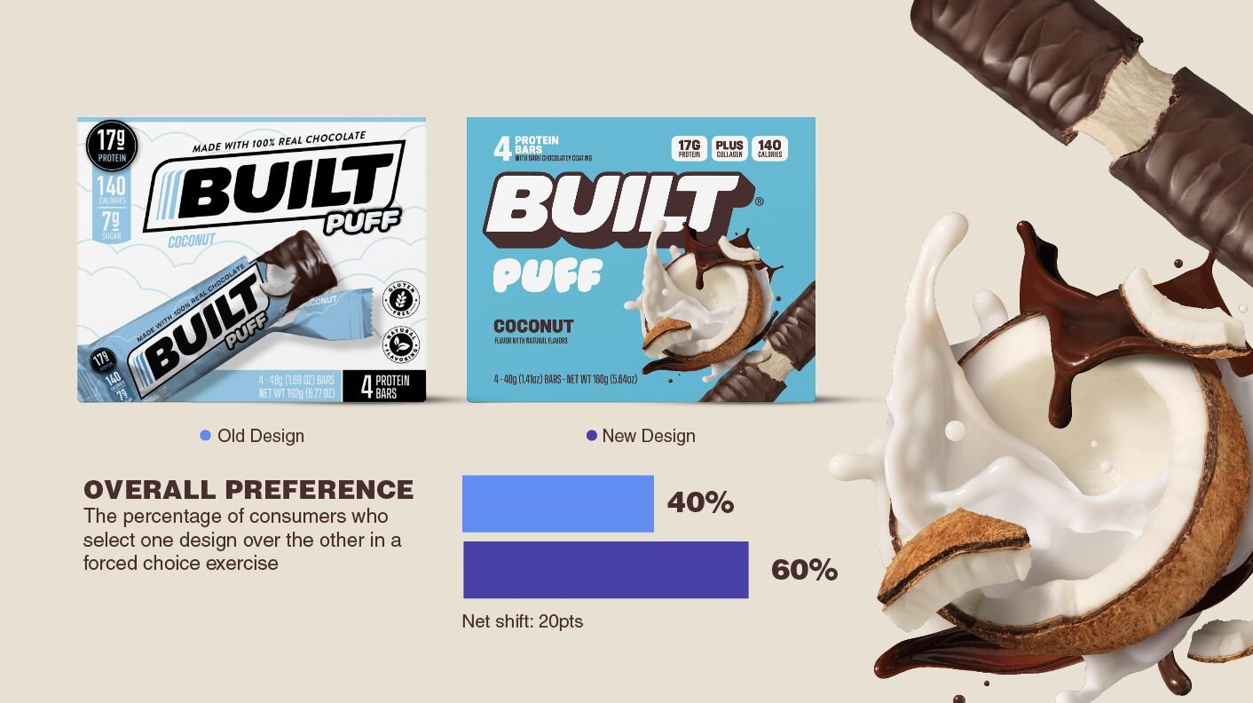
BUILT came to us for a brand refresh. They knew that they were crushing in D2C, but really wanted to set themselves up for success in retail settings. This meant, we wanted consumers shopping the bar set to see BUILT and immediately crave giving this bar a try. Their previous packs had a sort of intense, typical dark wordmark that you might see in this isle. We wanted to bring the approachable, energetic attitude we saw in their primary buyers > big, bright, 3D wordmark to anchor our packs. We then saw opportunity with showcasing their flavor in a more prevalent way. Flavor is HUGE for them, because these bars are so delicious (please do try.) Their old packs showed the outer wrapping, and a bit stale art direction went it came to flavors. It felt duplicative. So we amped things up, brought some energy and dynamism to the flavor cues. The last distinctive asset i'll harp on is the tertiary element of our product names. We wanted this to nod to our product experience. The Puff is truly like a marshmallowy-cloud and the bar is more chewy. Our type choices reflected that product experience.
All in all, we made adjustments to their current pack to allow for stronger brand distinctiveness, create flavor appeal that stacks up to their experience, and create ease for consumers to navigate the pack and understand the product experience at the retail shelf.


