Olyra
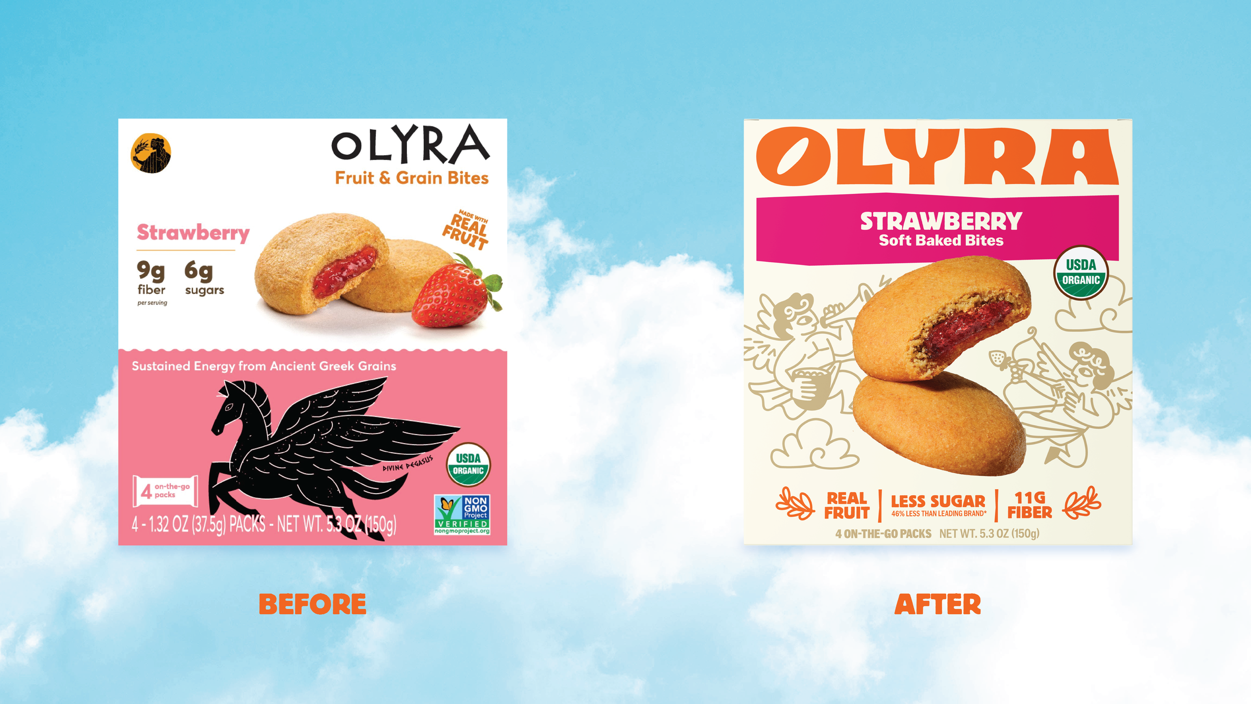
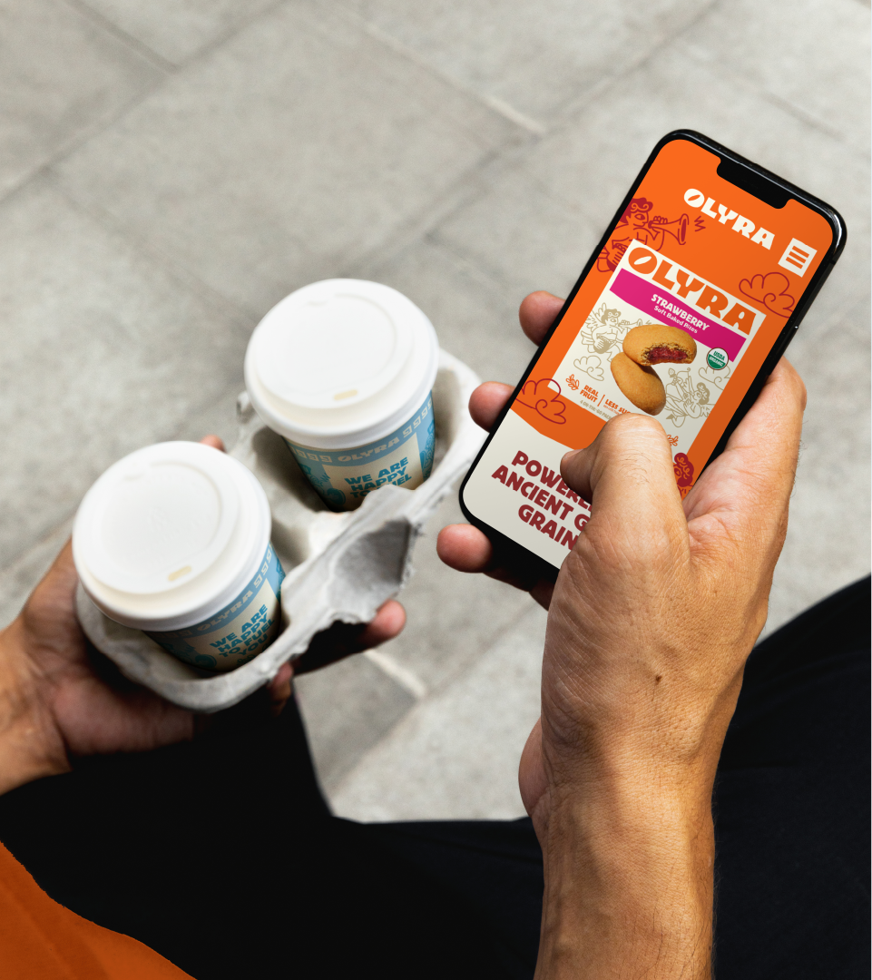
Olyra came to us at an inflection point — expanding distribution, new SKUs in the pipeline, and a product story worth telling that their packaging wasn't yet carrying. The brand had genuine soul: a five-generation family tradition, stone-milled ancient grains, and a Greek heritage with deep roots. The identity just hadn't caught up.
My role was to lead the creative vision from strategy through execution — building a system that could scale across formats while keeping the warmth and specificity of the brand's origin intact. That meant doing two things at once: sharpening the brand into something confident and shelf-ready, while making sure it still felt like Olyra.
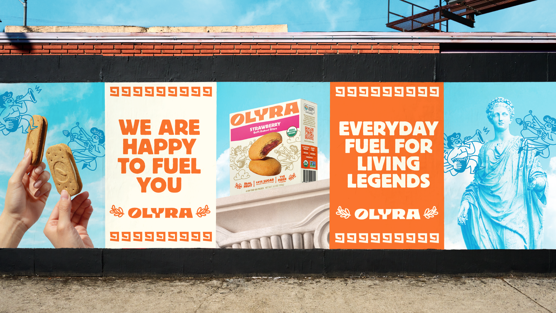
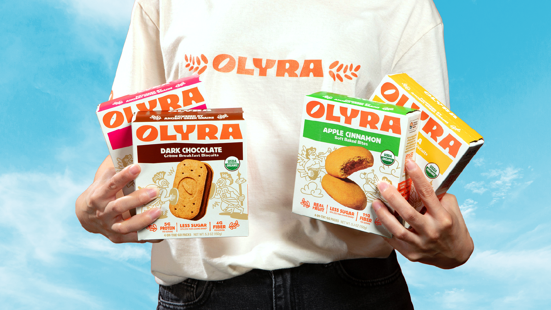
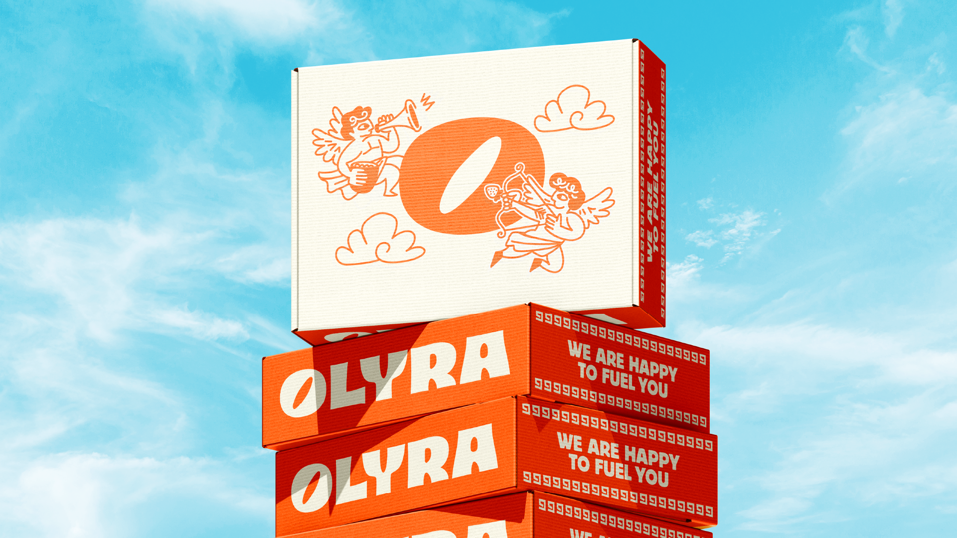
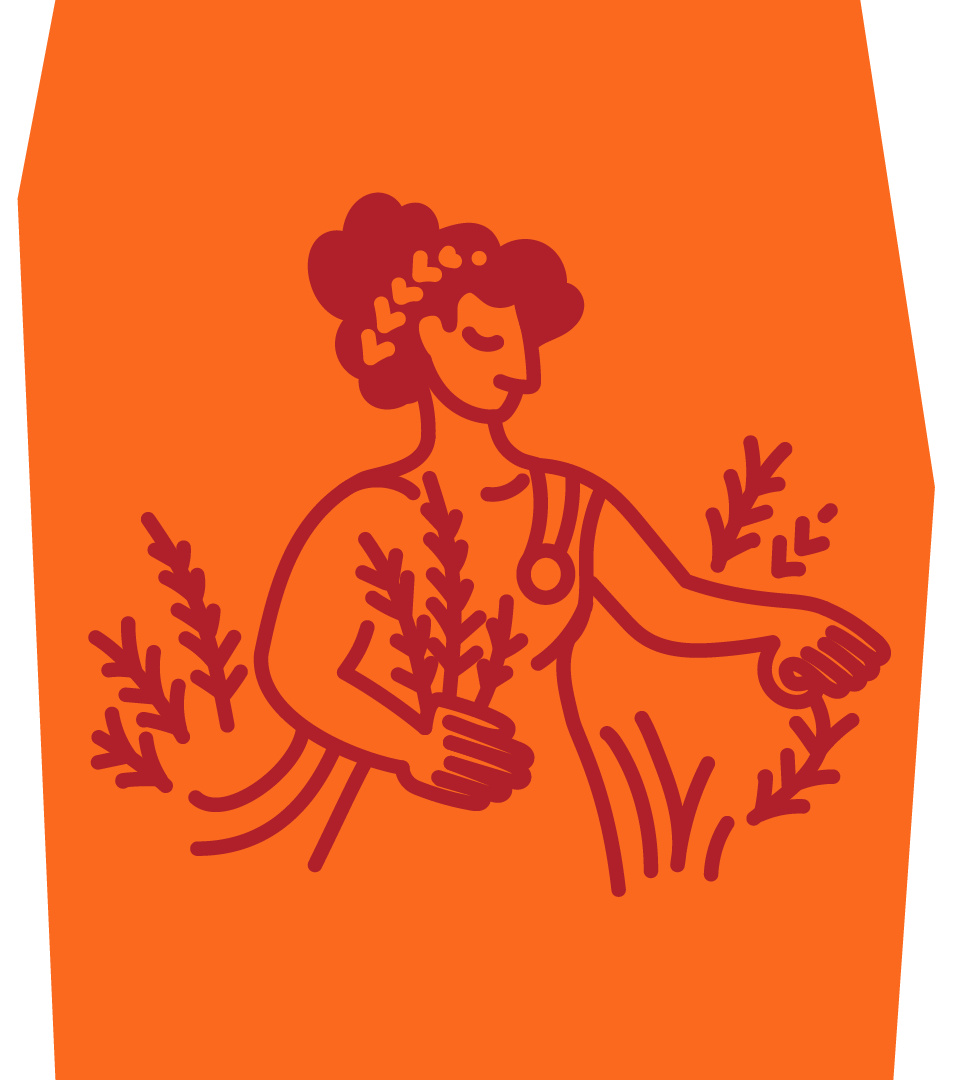
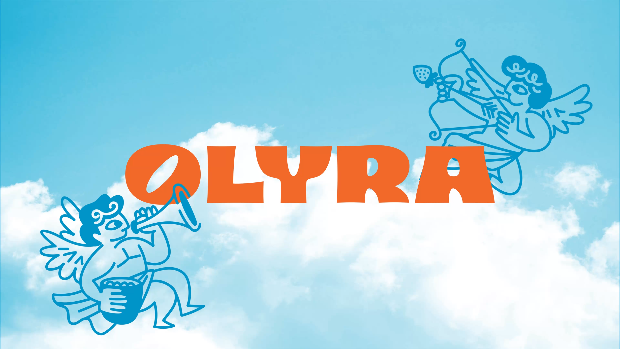
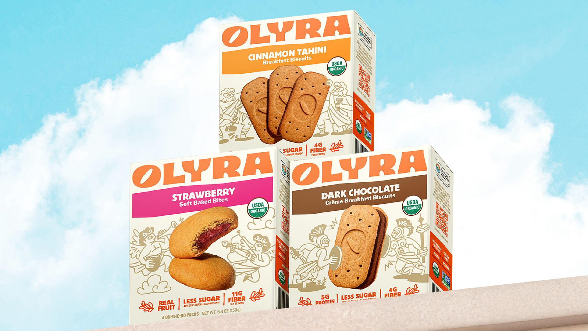
We rebuilt from the ground up — refined logo and type system, a more intentional color palette with clear flavor navigation, and custom illustration work rooted in Greek mythology. The goddess Dimitria anchors the back-of-pack storytelling, and each SKU features hand-drawn characters that are playful, bold, and distinctly on-brand. Every illustration earns its place as a story, not just decoration.
The result is a brand system built for growth: clear usage rules for type, color, photography, and illustration; a structure ready for new flavors and formats; and a visual world that feels alive on shelf and off.